📚📚 Improve your Data Analysis and Visualization skills. Learn about these essential top 10 type of charts
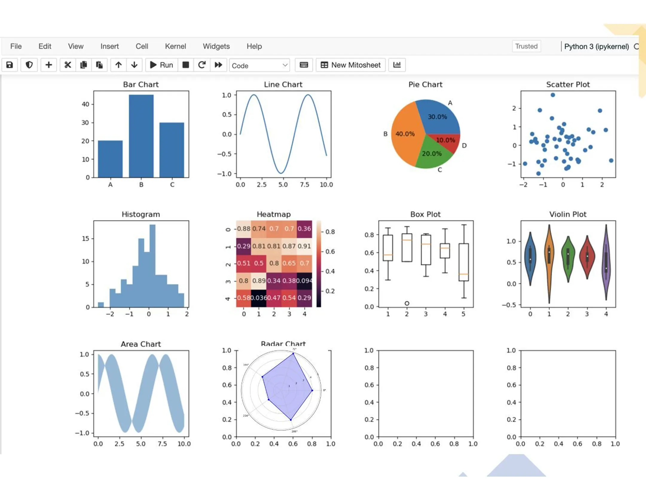
🔹Bar Chart:
A Bar Chart is commonly used to compare categorical data across different groups. It uses rectangular bars to represent the data’s magnitude and is perfect for visualizing data distributions, frequencies, and comparisons.
Usage: Compare sales figures of different products, visualize survey results by category.
🔹Line Chart:
A Line Chart is ideal for showing trends and changes over time. It connects data points with lines, making it easy to track variations and patterns in continuous data.
Usage: Track stock prices over a period, visualize temperature fluctuations.
🔹Pie Chart:
Pie Charts represent parts of a whole using slices of a circle. They are useful when you want to display the composition of a data set in terms of percentages.
Usage: Show the distribution of expenses in a budget, represent market share of different companies.
🔹Scatter Plot:
Scatter Plots use individual data points as dots on a plane. They’re employed to understand relationships between two variables and identify outliers.
Usage: Analyze the correlation between study time and exam scores, visualize the height-weight relationship in a dataset.
🔹Histogram:
Histograms display the distribution of numerical data by dividing it into bins and plotting the frequency or count of data points within each bin. They provide insights into data patterns and gaps.
Usage: Visualize the distribution of ages in a population, analyze the distribution of test scores.
🔹Heatmap:
Heatmaps use color to represent values in a matrix-like format. They’re suitable for displaying correlations, intensities, and patterns in two-dimensional data.
Usage: Show the correlation between variables in a dataset, visualize website traffic by day and time.
🔹Box Plot (Box-and-Whisker Plot):
Box Plots summarize data distribution, indicating median, quartiles, and potential outliers. They’re great for understanding the spread and central tendency of data.
Usage: Analyze the distribution of income in different regions, compare test scores across classes.
🔹Violin Plot:
Violin Plots combine aspects of box plots and kernel density plots. They provide a deeper understanding of data distribution and density.
Usage: Compare the distribution of salaries across different departments, visualize the distribution of data in different weather conditions.
🔹Area Chart:
Area Charts are similar to Line Charts, but the area beneath the line is shaded. They’re useful for showing cumulative data or overlapping trends.
Usage: Visualize the cumulative revenue over months, compare the growth of multiple products.
🔹Radar Chart (Spider Chart):
Radar Charts display multivariate data on a two-dimensional plane with axes radiating from a central point. They’re effective for comparing multiple variables at once.